Imagine living in a world without balance. Everything would turn upside down, with collapses, shifting scales, and confusing disorder. Equilibrium is equally important in the art world. An invisible force keeps a composition together to create harmony and order. We need balance in everything, are creating balance in art is one of those.
What Is Balance in Art
Balance in art refers to how visual aspects and different art elements are out within a piece. Large, brightly colored things can add more weight to a piece, while smaller, lighter-looking objects might give it a more airy appearance.
An object's visual weight shows how much attention it requires. In order to maintain or create visual equilibrium, balance refers to how the composition's various elements—line, shape, color, value, space, form, and texture—relate to one another in terms of their visual weight. In other words, neither side appears to be heavier than the other.
Balance In Art Examples
Below are a few balance artwork examples that were created by the most famous artists. Their work perfectly defines the details of balancing elements and their effects. By the paintings, you will know how you can create balance in art and what effect it has on your artwork.
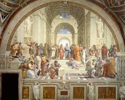
1- The first example is "The School of Athens," a painting by the famous artist Raphael. This painting shows symmetrical balance. The figures are arranged in order inside a semicircle at the top, with the people in the middle as the focal points, creating a sense of harmony and balance.
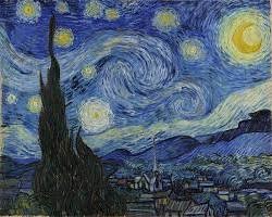
2- Vincent van Gogh's famous painting "The Starry Night" is an example of asymmetrical balance. Although the painting uses many colors, shapes, and elements, it is still well-balanced.
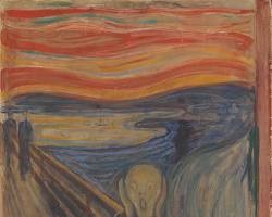
3- "The Scream" is a well known painting by Edvard Munch. It has a lot of expressions and multiple color combinations that are perfectly balanced. Asymmetrical balance is used in it to create a sense of anxiety and tension.
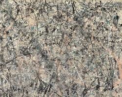
4- Jackson Pollock is an artist who created the artwork "Number 1, 1950 (Lavender Mist)". His paintings are well known to be chaotic but there is a sense of radical balance in art created by him. Especially in the painting you see below is an example of radical balance.
Balance Definition in Art
In art, balance is defined as a perfect distribution of colors, objects, textures, spaces, and other elements. These elements are balanced in the art to give the artwork and the message that has been conveyed through its stability.
Asymmetrical Balance in Art
When an artwork's composition is not symmetrical but rather distributes visual weight evenly between its two sides, it is said to have asymmetrical balance. This preserves the artwork's sense of balance while releasing a picture from the limitations of symmetry.
Although there are many things that appear balanced, the world is not symmetrical, which creates greater opportunity for artistic expression using a more realistic approach. In addition to providing interesting lines for the eye to follow, asymmetrical balance also allows the observer to move and sway within the image as opposed to being drawn only to the focal point. One can establish asymmetrical balance in design in a number of ways.
Any part of the art or any quality that it has. Whether it is the color or the contrast can be used to balance the artwork you are creating. For example, Imagine there is an art piece or a painting with one large orb painted on its right side and a void on its left side of the painting.
Though the intention here is to create an asymmetrical balance, the composition is now off-balance. To create an uneven equilibrium or balance the visual weight, the painter can add multiple tiny orbs in a pattern on the left. Other than this, they could add a smaller, bright-colored form to balance the big, dullly colored sphere.
Symmetrical Balance in Art
When visual elements are placed equally on both sides of a center line, a work of art creates symmetrical balance. One way to understand symmetrical balance, also known as formal balance, is to imagine one half of a piece of art mirrored on the other.
Draw a line through the middle of the piece of art, then compare the two sides to see if it creates a symmetrical balance. Symmetric balance is attained when the positive and negative spaces are the same weight and location on either side.
The usage of symmetrical balance also depends on the subject and medium of the artwork. Basically, the purpose that symmetrical balance serves in art is that it creates stability and a center or a focal point that can maintain the artwork's main motive.
Radial Balance in Art
Radial balance is multidirectional symmetry. The placement of visual components around a focal point is known as radial balance. As visual features radiate from a center point, radial balance is frequently a form of circular symmetrical balance. The organized pattern that the visual elements make as they radiate can lend depth, a sense of movement, and a focal point to a picture.
Similar to the spokes on a bicycle, the composition's visual components are grouped around a central point. Circle designs are frequently radially balanced. Squares, hexagons, octagons, stars, and other shapes can also be arranged in a radial pattern.
Architectural domes and windows, clocks, compasses, and automobile wheels are examples of human-made designs that exhibit radial balance. Mandala of Amitayus, unidentified artist, South Rose Window, Notre Dame, Paris, 19th-century Tibetan school Mandalas are yet another obviously human pattern that makes use of radial balancing.
Types Of Balance in Art
These are the types of balance, and among them, symmetrical, asymmetrical, and radial balance are the most common ones:
- Symmetrical balance: When Elements on the one side of the composition are mirrored to the other side this creates symmetrical balance.
- Asymmetrical balance: In asymmetrical balance, elements are different on both sides and still, an equilibrium is created.
- Radial balance: In radical balance, elements radiate towards the outer side from a main or central point.
- Crystallographic balance sounds complex, but it simply connects to the symmetry that is achieved by making shapes and patterns within a composition. Its use not only boosts the beauty of the artwork and increases visual interest but also reflects a deep message or understanding of the mathematical concepts and forms. It is commonly used in wallpaper designs and textiles.
- Gestalt balance is created when a design composition is balanced with the help of visual weight. This type of balance takes place when an object with a strong visual weight is balanced with one or more objects with lesser visual weight. It's about creating harmony in elements that seem attractive at first look.
Balance is important in art as it guides the audience's eye, creates order, and prevents the artwork from feeling messed up or confusing.
Principles Of Design Balance
Balance is one of the main key principles in design.
Radial balance: From a main point, elements radiate 3 main categories of balance exist:
Compositional symmetry is achieved by mirroring elements on both sides.
Asymmetrical balance: Despite having different components on each side, the equilibrium is never created. It speaks to how the components of a composition are arranged and given visual weight. An equilibrium and visual interest are the main characteristics of a well-balanced design.
But don't let the term "equilibrium" mislead you. Not all elements need to be given the same amount of weight in a balanced design. Instead, it just indicates that every component functions as a complete to form a cohesive whole, with no one component taking center stage.
Other than this, the most visually attractive option is an unequal equilibrium. (We'll talk about the many forms of balance in more detail later!
Still, there is a place and a time for symmetrically balanced designs. This style of design appears solid. For designs that are simple where each piece has equal weight or for more official texts, it might be a useful option.
Formal Balance in Art
Radial balance: From a core point, elements radiateThree primary categories of balance exist:
Compositional symmetry is achieved by mirroring elements on both sides.
Asymmetrical balance: Despite having distinct components on each side, the equilibrium is nevertheless created. Achieving aesthetic harmony and visual appeal is based on formal balance. It describes the intentional placement of components inside a composition, making sure that they are spaced out to produce a sense of stability and equilibrium.
Symmetrical and asymmetrical techniques are the two main ways to establish formal balance. Bilateral symmetry, also known as symmetrical balance, is the process of reflecting parts along a central axis to create a composition that is visually the same on both sides.
In architecture, this kind of balance is frequently observed, as the left and right sides of a structure are frequently mirror reflections of one another. Asymmetrical balancing, on the other hand, attains equilibrium by carefully positioning components of different sizes, shapes, and weights so that they counteract one another.
Symmetrical balance can provoke emotions in the audience because of the order it has in it and the way it focuses the center of an artwork. There are multiple elements, and to create balance, you should know the principles and the art of balancing them. This comes up time as well as the practice. Form balance art is all about setting formal balance in the art.
The formal balance plays an important role in conveying the message and gives the art a much deeper meaning. The careful arrangement of elements can really impact teh feelings of the people.
It can create curiosity in them and take more interest in the painting or the artwork. Formal balance is a powerful tool for the artist to communicate their ideas and build connectivity with the audience.
Balance In Art Drawing
The principles of the design show the ways an artist can use the elements of art in their artwork. Balance means a fair distribution of the visual weight of all art elements. Those elements are what you have to balance on the drawings.
Easy Symmetrical and Asymmetrical Balance in Art
Asymmetrical balance is something that manages to create a sense of balance, even if it is not symmetrical. Its definition is opposite to the easy, symmetrical balance in art when all visual objects in the design are distanced equally from the central point.
As told above Symmetrical balance is creating symmetry. Asymmetrical balance creates Asymmetry, which means that two halves of the work are different; however, they try to create balance.
Line, Space, Form, Visual and Texture Balance Art
There are seven different elements of art that an artist uses to create their artwork. An element is something that is an aspect of an artwork when it is combined, with other elements. It makes the artwork look perfect and outstanding. It is impossible to create artwork that doesn't even have a single element of it.
To become a professional artist, you must know how to work with lines, spacing, forms, visuals, and textures because these are the main elements. These set an artistic impression in your artwork.
Each of these element define something special that contributes to shaping your art. Lines define shapes and create symmetry. Spacing brings a balance. All of the elements together create a balanced look on the canvas.
Balance In Graphic Design
Balance is an important effect in graphic design. When we talk about graphic designing almost everything is connected to balance. When you make an image or a logo what gives it a clean and clear look is the way you balance elements in it.
There are different ways to achieve balance in graphic design. Some common methods include adding symmetrical balance, asymmetrical balance, or radial balance.
Which Is Not a Way to Create Balance in Art?
Unbalance is not a way to create balance in your artwork. While it might seem contrary, unbalance is, of course, the antonym of balance. Balance creates order and harmony in the art when you arrange all the elements in an order.
While working on your idea or art project, you must know that adding all the elements together can make it look suffocated and congested, and balance can not be formed that way. So, this is also not a way to find balance.
Why Is Balance Important in Art?
Balance is important for visual harmony and emotions that exist in your art because of the balance you create. It's a basic principle that directs the eye, provokes emotions, and tells a story. However, it's actually more than just an artistic decision.
Attracting the observer to pause and reflect, a well-balanced composition shows a sense of stability, equilibrium, and order. Through its creation of a visual anchor, other elements connect from this point of reference. Symmetry and an even weight distribution are only two aspects of balance.
Balance in art is a finely balanced dance between chaos and order that calls for a strong sense of clarity in addition to a thorough comprehension of the visual language. With the use of this technique, artists direct the gaze of viewers, showcase their experience, and reflect a wide spectrum of emotions.
Balance is the unnoticeable element that unites everything, whether it is the calm symmetry of a landscape painting or the chaoticity of an abstract expressionist artwork.
What Is the Difference Between Proportion and Balance in Art?
Balance and proportion are two different things in the field of art, even though they are sometimes very much connected to each other. Within a composition, proportion describes the proportions of different items or elements.
Achieving a harmonious arrangement of components is important to prevent anything from feeling too big or too little. Imagine a balance in art photography in which the head and body are proportionately balanced and produce a realistic and amazing portrayal.
Making sure that the elements are placed in a steady and perfect manner is important to achieving a sense of harmony. Asymmetrical balance, in which the elements are organized in a way that feels balanced but isn't exactly the same, or symmetrical balance, in which the elements are mirrored on both sides, can be used to create this.
Just like that, proportion relates to the dimensions of the components, whereas balance concerns the arrangement of those components. All this work together creates a dance of visual harmony that makes a composition feel harmonious and beautiful.
What Is the Principle of Art Responsible for Visual Equilibrium?
Balance is the artistic principle that creates a visual flow in the artwork. It's the unseen force that stabilizes a composition and keeps it from falling over or getting conjusrted. The distribution of visual weight in any artwork achieves balance. It is a subjective quality that is based on dimensions, color, positioning, and shape; weight is not expressed in pounds or kilograms.
For example, when the weights on both sides of a teeter-totter are equal, the board stays level. The composition's components are referred to as "weights" in art. For instance, an object that is big and dark has greater visual weight than one that is small and light. Artists can achieve a sense of stability and clearity by carefully positioning these components.
The components of symmetrical balance are positioned symmetrically on both sides of a central axis. It's frequently used in traditional art forms and architecture. On the other side, asymmetrical balance is more dynamic.
It entails dividing things out in an odd way while maintaining a sense of equilibrium. A feeling of tension and movement can be produced by this kind of balance.
Balance is a basic concept that underpins all successful artworks, whether the calm symmetry of a landscape painting or the dynamic Asymmetry of a modern sculpture. It's the unseen glue that keeps the composition cohesive and gives it both a beautiful aesthetic and emotional resonance.
Define Balance.
In general, if we talk about the word 'balance' normally the first things that might comes to your mind would be equal. For example, in maths, when we balance an equation, we try to make every side equal. Just like that, In science, balance is a tool that allows you to make each side of the equal mass. Its like a formula of equality.
Explain The Difference Between Formal Balance and Structural Balance.
In art, visual equilibrium can be attained in two separate ways: structurally and formalistically.
Formal balance resembles a mirror image. It is often referred to as symmetrical balance. Just picture cutting out a form after folding a piece of paper in half. The paper will be the same in both parts when you unfold it.
The components on one side of the composition are mirrored on the other, which is known as formal equilibrium in art. As a result, stability, symmetry, and order are produced. Traditional art forms like painting and building frequently use it.
Asymmetrical balance is another name for structural balance. It is interesting to explain it by connecting it with the seesaw as an example. By altering the position of the weights on both sides, you can achieve balance without having an exact weight on either side.
When parts on one side of a composition feel balanced despite not being mirrored on the other, this is known as structural balance in art. As a result, there is movement and interest created. Modern art and design frequently employ it.
Therefore, although formal and structural balance shares the goal of achieving equilibrium, they approach it differently. Structural balance is about Asymmetry and dynamism, whereas formal balance is about order and symmetry.
Conclusion:
Learning the elements and principles of art is important, especially if you want to start making your art professionally. It excels you in your art craft and helps you create stunning art pieces. It allows you, as an artist, to appreciate it.
It invites interested audiences to look deeper into your art work, unveiling your creative ideas and concepts for all of us to appreciate that little more. As we have learned in the article, balance is an important element; an artist works with his creativity and, of course, with practice, understands how to use which element where even more.


